chì
Because pencils
deserve better
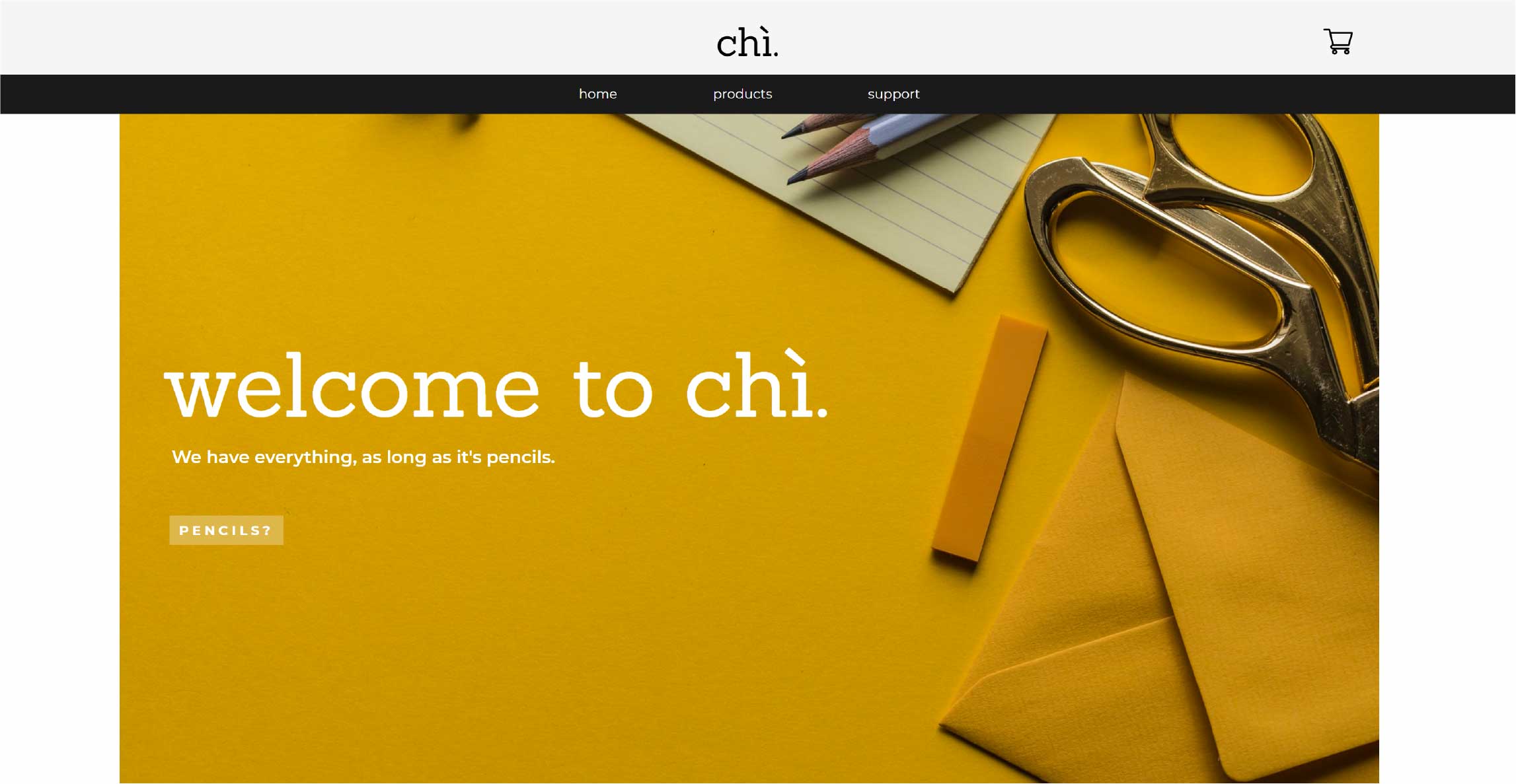
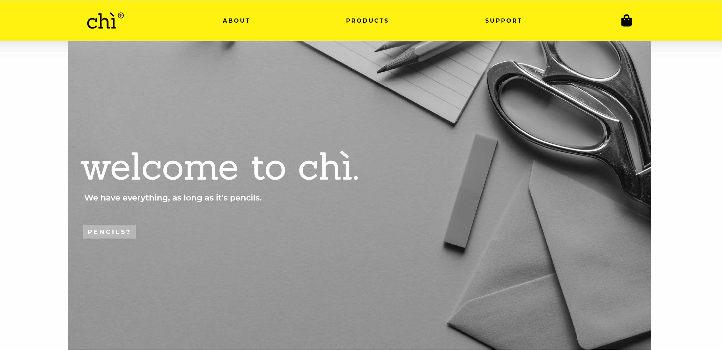
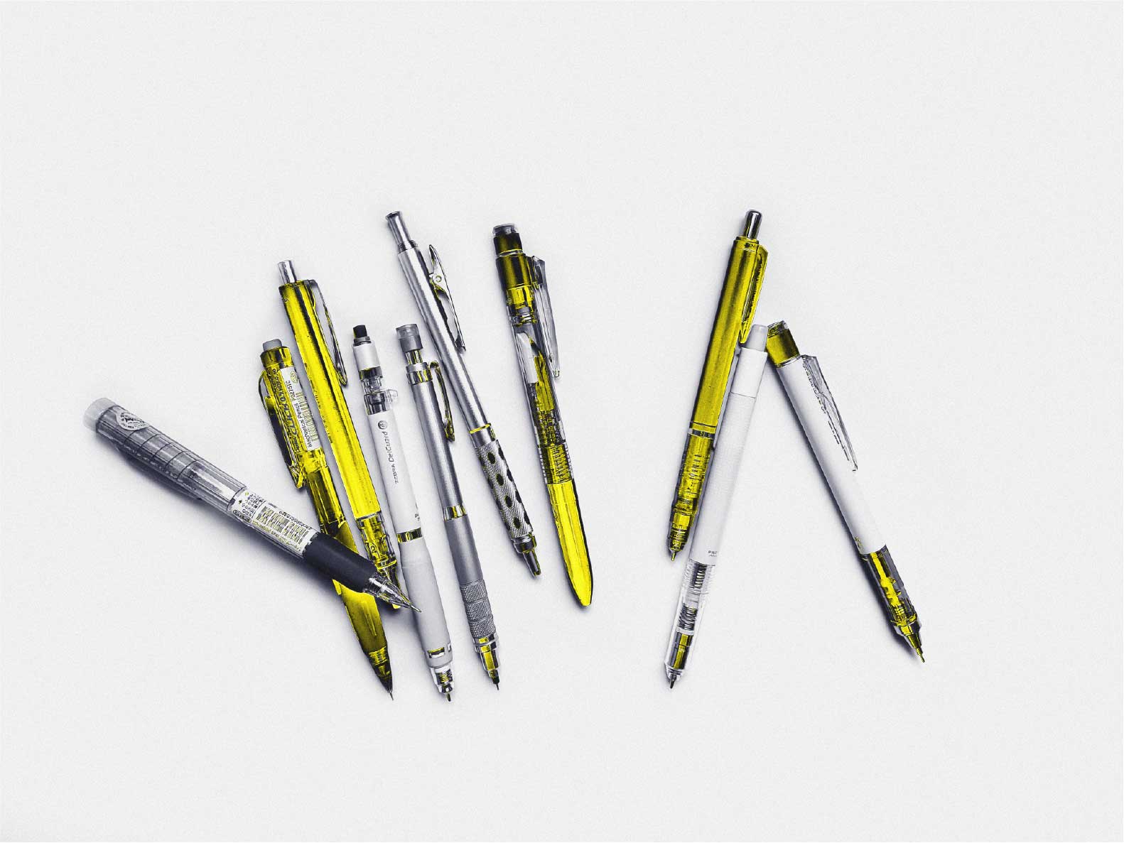
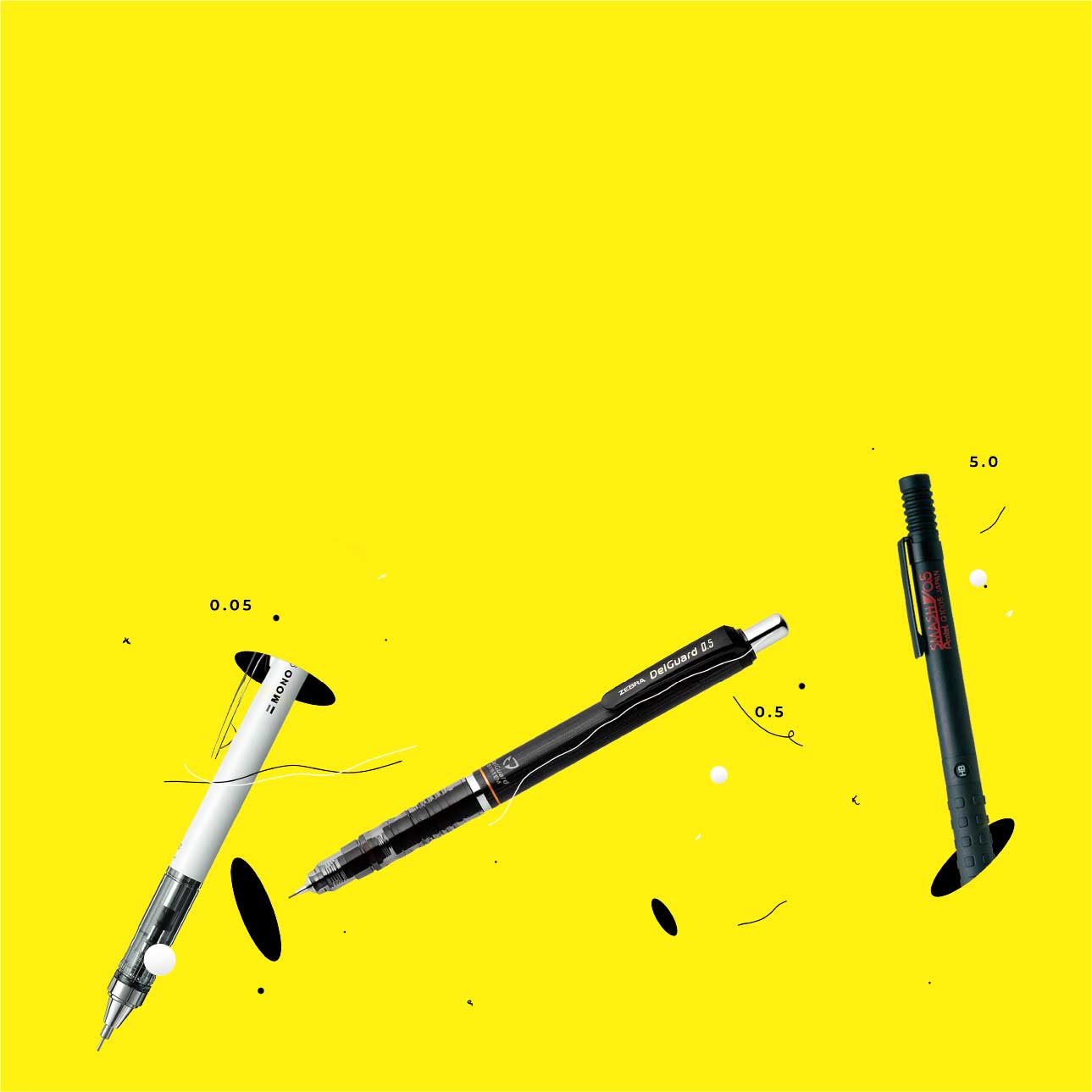
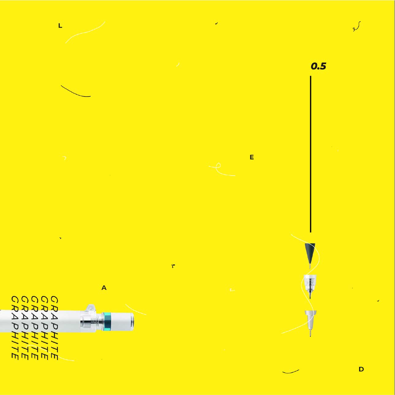
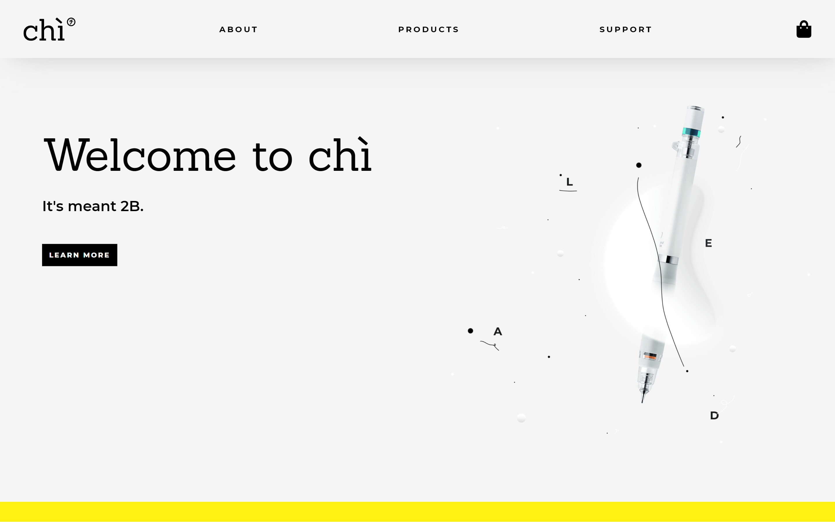
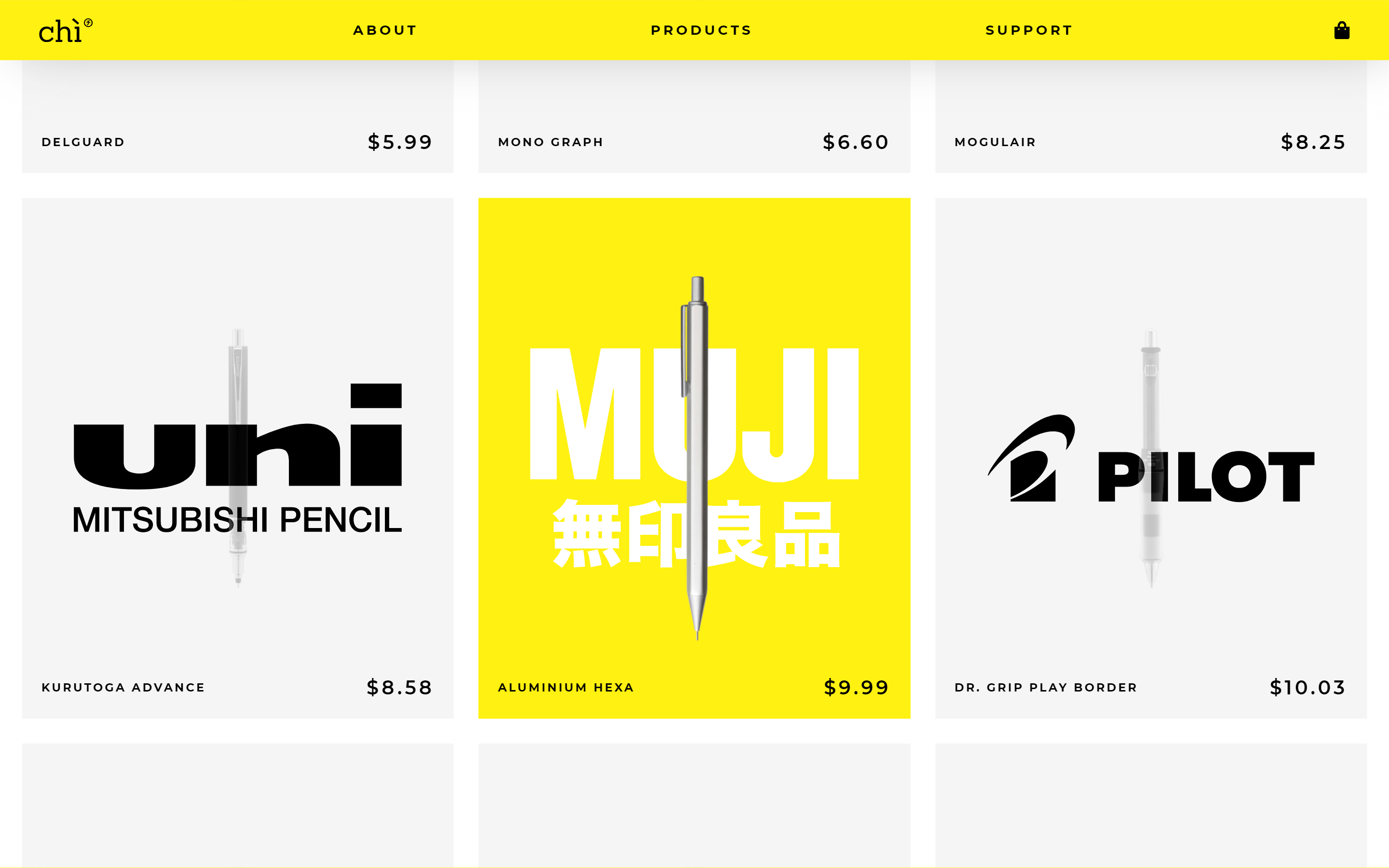
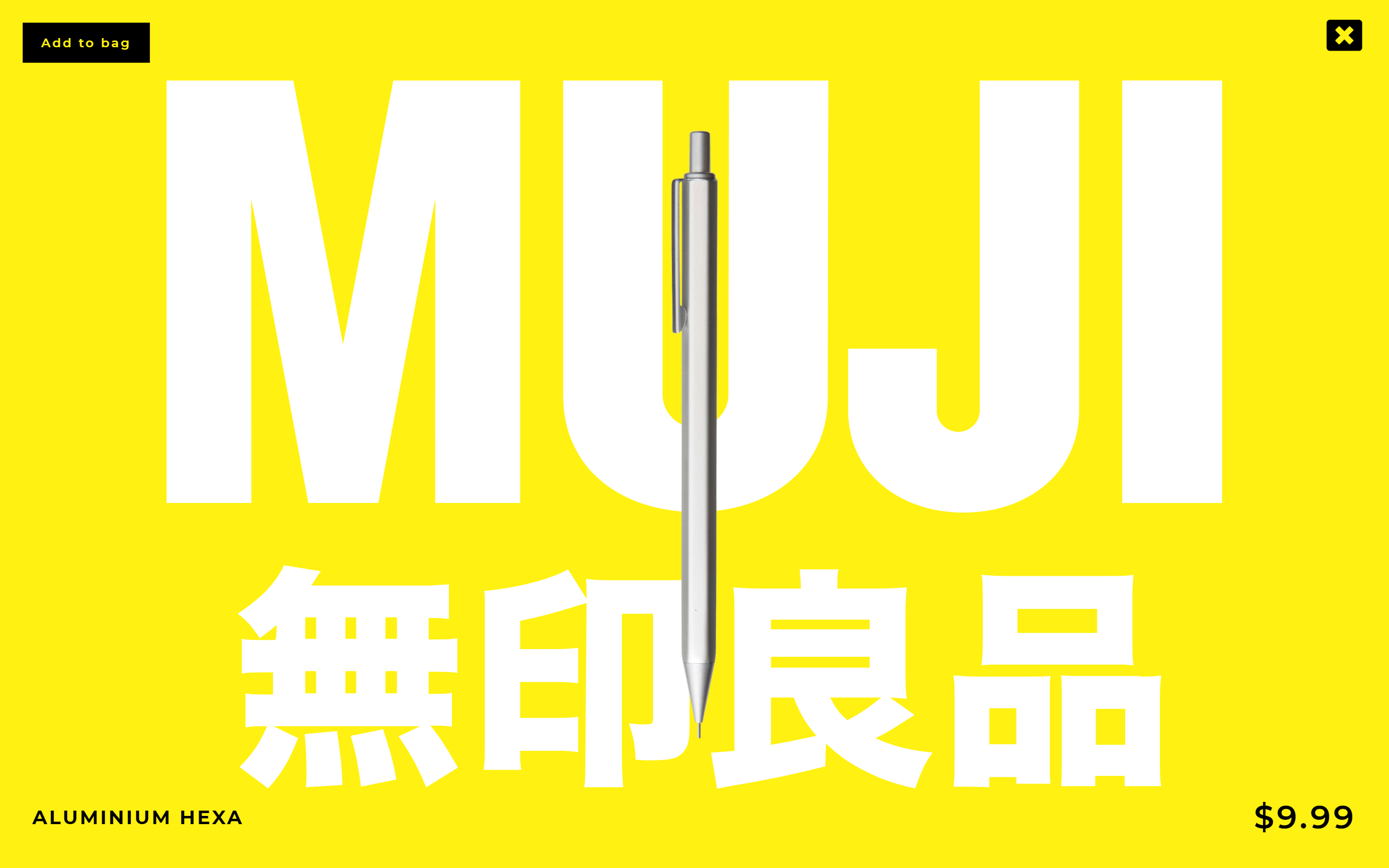
A clean interaction project born out of the necessity to eliminate clutter, chì is a stationery site that sells exclusive mechanical pencils. The pages features a clean, sleek and more modern design. Yellow was chosen from the color of a number 2 pencil, ironically not a product that this site carries.
Market
e-commerce, stationery, retail, manufacturing.
Technologies
HTML, CSS, JS, Photoshop, Illustrator, XD
Audience
chì is a site with attitude that would only mesh well with a demographic that can handle the edge. This means the audience will either be 13-25 or 9-12.
Output
Branding
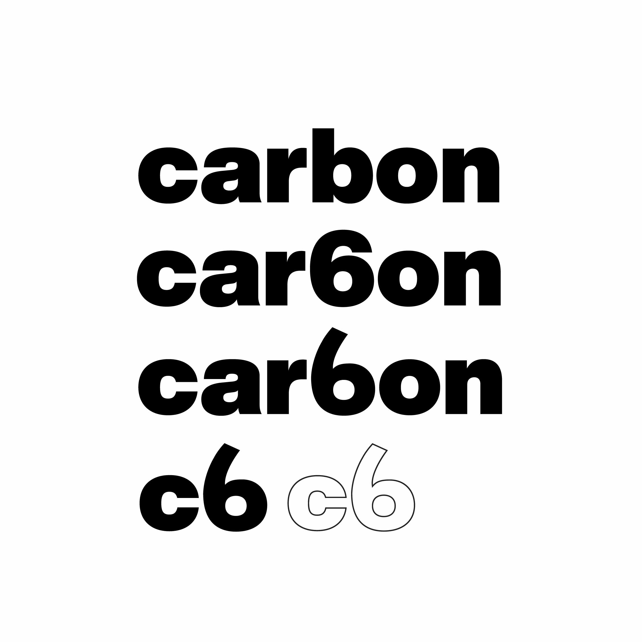
car6on or c6 was initially chosen because pencil lead is made from graphite, which is composed of carbon atoms and the atomic number of carbon is 6, hence, c6.
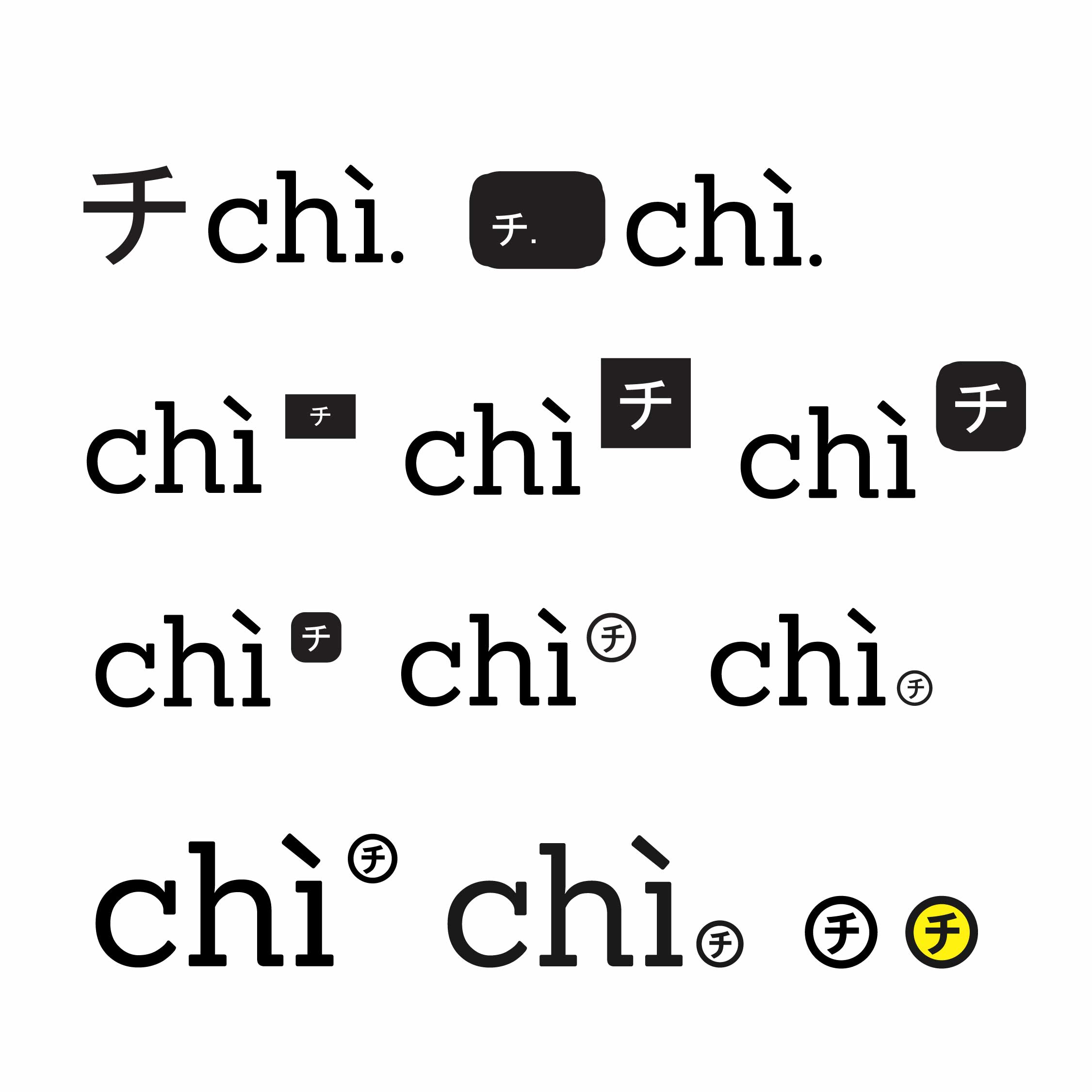
chì was finally selected because of its short and sweet nature. It means “lead” in vietnamese, in which pencil is called bút chì (lead pen).
The character next to chì is the Japanese Katakana for the “chi” sound. It was just chosen as a feature simply due to the fact that most mechanical pencils are made by Japanese companies
Process Images
